a2ru Debuts A New Look for its Next Decade
Sep 28, 2022
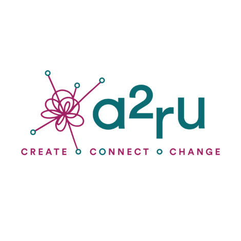
a2ru is celebrating its tenth anniversary with a new look!
Last year, a2ru launched a new website and a new membership model that welcomed all higher education institutions to join our network for the first time, as well as individual members. That meant, however, that our name,”The Alliance for the Arts in Research Universities,” was no longer an accurate characterization of this larger, more inclusive community (in addition to being a mouthful to say). Change was in order, and our new logo designs reflect those changes.
Moving forward, we will primarily refer to ourselves as a2ru, rather than the Alliance for the Arts in Research Universities. Our new tagline, “Create. Connect. Change.” reflects our commitment to build community and drive transformative culture change for the arts and arts integration across the higher education sector, while fostering innovative and generative connections between ideas, disciplines, people and institutions.
The new logo designs were created by Paige Rieger of wiggly.jpg; a graphic designer and illustrator, Paige is an alum of the Stamps School of Art & Design at a2ru’s administrative home, the University of Michigan. Over the course of the summer, Paige worked closely with the a2ru staff to develop and refine concepts for the logo, with input from the a2ru Executive Committee and other a2ru community members.
Rieger says, “Working on the a2ru rebrand was an incredibly rewarding project. Having worked previously on branding the Creative Placemaking Resource Hub, I was so excited to refresh the a2ru logo and brand while still connecting visually with The Hub. We wanted to keep the “a2ru” acronym while utilizing a more engaging tagline and visual, all while creating a brand that felt inclusive, creative, and knowledgeable. We ultimately landed on a “brainstorm” icon that visually conveys the new tagline: the curved, overlapping lines allude to creative mark-making. A brainstorm of ideas are connecting, coming together. And the icon (as well as the movement of the type) feel like they are moving, growing, and changing.”
The designs also feature the brand colors and font families chosen during our website redesign last year by Phire Group, our web design and development firm.
Watch a time-lapse video of some of Rieger’s process: